seven thoughts on design
Simplicity is the hardest craft
·
Design laterally before linearly
·
Be thoughtful first, intent before pixels
·
Focus on interconnectedness than parts
·
Framing is a design tool
·
Velocity delivers better quality than speed
·
Experience lives in code, design to ship and create impact
·

Bringing Pass value into the user's intent journey
Increasing passes adoption and revenue and perceived value of Passes
Product design
Growth Design
2023
Design Strategy
Bringing Pass value into the user's intent journey
Increasing passes adoption and revenue and perceived value of Passes
Product design
Growth Design
2023
Design Strategy
*Optimised for the mobile, full case study on Desktop version

Impact and Outcomes
+65%
Pass Purchase Conversion Rate
Relative lift in purchases when surfaced contextually during vehicle selection vs. the menu.
4.2%
Localized GMV Expansion
Incremental revenue growth driven by upfront pass monetization within the pilot market.
1.9
Increase in monthly trips
Avg increase in monthly rides by users who transitioned from pay-as-you-go to active pass holders.
34.7%
MoM Re-purchase Rate
% of pass buyers who purchased a subsequent pass within a 30-day window.
Impact and Outcomes
+65%
Pass Purchase CVR
Relative lift in purchases when surfaced contextually during vehicle selection vs. the menu.
4.2%
Localized GMV Expansion
Incremental revenue growth driven by upfront pass monetization within the pilot market.
1.9
Increase in monthly trips
Avg increase in monthly rides by users who transitioned from pay-as-you-go to active pass holders.
34.7%
MoM Re-purchase Rate
% of pass buyers who purchased a subsequent pass within a 30-day window.
Context
One place, two conflicting mental models
At Bolt, the overarching business objective was to drive customer lifetime value (LTV) through upfront subscriptions. Bolt introduced Bolt Plus subscriptions (a long-term, auto-renewed). However, it was introduced to live in the exact same place of the existing Passes (time-based, one time purchase)
My role
IC Senior Product Designer- End to end product thinking and strategic design
Platform
Bolt Micro-mobility iOS/Android
Timeline
2 weeks design | Multi-variant A/B Testing & Phased Roadmap Delivery
Why this project?
Challenge the status quo and explore beyond the scope, I am proud of this project as I came up with a very novel approach to the problem. I reframed the team's approach by proposing that passes should come to users than users going to passes. We moved away from generic 'visibility fixes' to a multi-directional experimentation framework to test this contextual approach, completely transforming how our users discover and value passes.

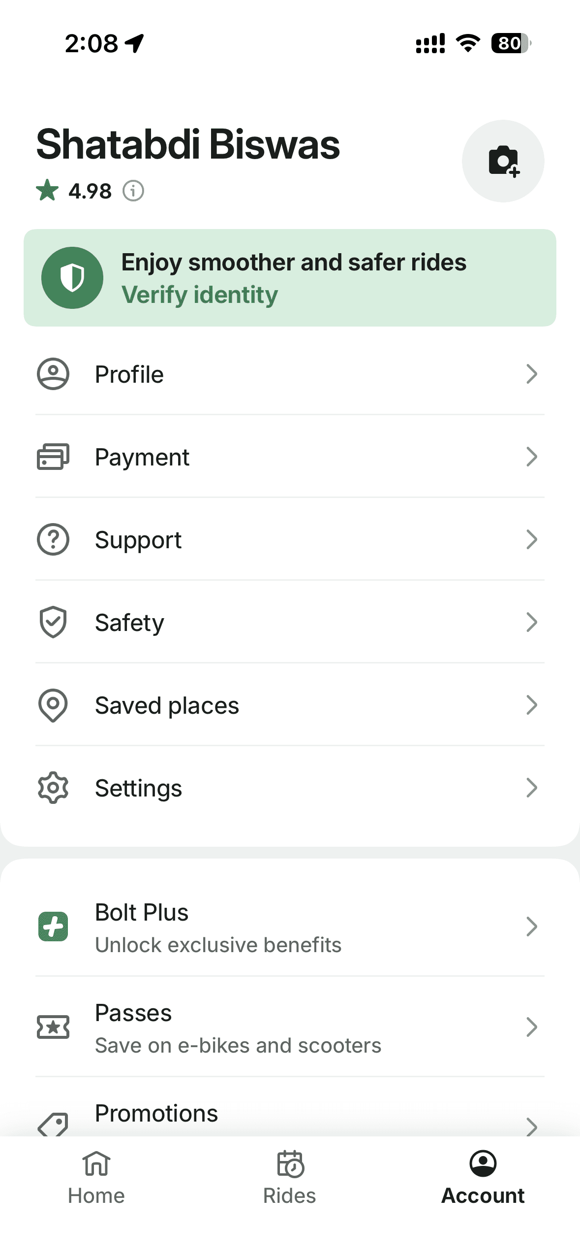
Existing flow
The Observation
We saw that, users were aware of Passes, we saw engagement on the passes page but the conversion remained lower and the drop-off was over 85%.
..the effort of pass purchasing decision was lost in the interaction of back and forth on a screen estate surface that was disconnected from micro-mobility ride decision.
The Reveal
The Reveal
The issue wasn't just visibility. It was a decision problem.
The issue wasn't just visibility. It was a decision problem.
People weren't thinking about subscriptions when they only wanted to start a ride. A completely different presence made users make a purchase decision before they "find the right scooter to ride" I reframed the problem statement from a visibility problem to decision problem. Passes suffered from a context and decision problem rather than only a visibility problem.
Lack of Contextual Continuity
Passes required users to leave the ride journey and enter a separate subscription page hidden within the menu. This meant the purchase decision happened outside the most intentional moment.
High Interaction Cost: Users were stuck comparing
Data showed repeated back and forth between passes. The information structure forced users to hold each option in memory and compare sequentially which led to decision paralysis to decide on which pass was right for them, whether it would save them money and why they should buy it now.
Banner-based promotion was ineffective
A promotional banner existed within the micro-mobility section competed with other priority banners, it was easy to dismiss, other priority banners would make it lower in priority, engagement dropped over time.


How might we help riders make a confident decision without interrupting their scooter selection decision?
How might we help riders make a confident decision without interrupting their scooter selection decision?
How might we help riders make a confident decision without interrupting their scooter selection decision?
The Pivot
Challenge the status quo and explore beyond the scope
The existing product roadmap was hyper-focused on fixing the hidden store page. However, I realized that optimizing a broken destination wouldn't solve the core problem. While the product and engineers had commitments, I invested the opportunity to explore the problem beyond the given requirements. I explored two directions with multiple iteration within the timeline of 2 weeks, focusing on the principle bringing passes to the users rather users going to passes.
But There were many tiny, but important questions to address within the design to make the experience of contextual Passes seamless and clear: "Which pass is the best to show? How might we communicate the users that they have saved money? "How many passes should the user see ?" After aligning the initial concepts, the project was phased into two parts
The existing product roadmap was hyper-focused on fixing the visibility of passes. However, I realized that optimizing a broken destination wouldn't solve the core problem. While the product and engineers had commitments, I invested the opportunity to explore the problem beyond the given requirements. I explored two directions with multiple iteration within the timeline of 2 weeks, focusing on the principle bringing passes to the users rather users going to passes.
But There were many tiny, but important questions to address within the design to make the experience of contextual Passes seamless and clear: "Which pass is the best to show? How might we communicate the users that they have saved money? "How many passes should the user see ?" After aligning the initial concepts, the project was phased into two parts
Phase 1: Perceived Separation (The Immediate Ship)
Execution: We agreed, we had to separate micro-mobility passes from ride-hailing subscriptions. But for the immediate ship, I introduced distinct, scooter-centric visual taxonomy and contextual entry points within the vehicle exploration views.
Strategic Value: Cleared technical and visual debt, establishing a clean experimental baseline for Phase 2. Phase one also gave opportunity to optimise pricing strategies and reduce the number of passes in different countries.
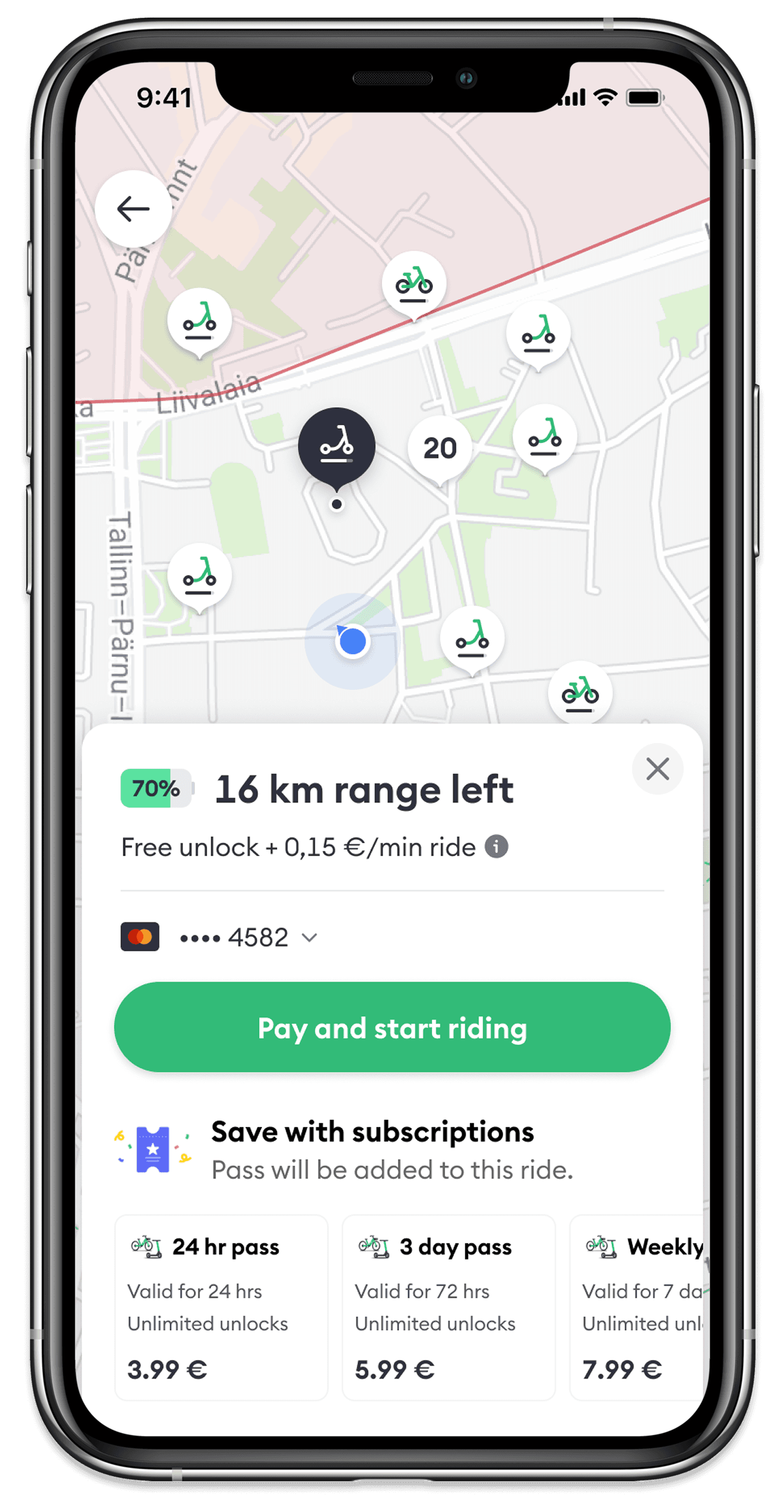
Phase 2: Contextual Intent Integration
Execution: We brought our existing pass inventory directly into the scooter vehicle card journey. To prevent overloading the user on this small mobile real estate, I explored multiple layouts.
Strategic Value: Users could finally see relevant, existing pass options inline with their vehicle without being overwhelmed by too many passes.
The Pivot
Challenge the status quo and explore beyond the scope
The existing product roadmap was hyper-focused on fixing the hidden store page. However, I realized that optimizing a broken destination wouldn't solve the core problem. While the product and engineers had commitments, I invested the opportunity to explore the problem beyond the given requirements. I explored two directions with multiple iteration within the timeline of 2 weeks, focusing on the principle bringing passes to the users rather users going to passes.
Phase 1: Perceived Separation (The Immediate Ship)
Execution: We agreed, we had to separate micro-mobility passes from ride-hailing subscriptions. But for the immediate ship, I introduced distinct, scooter-centric visual taxonomy and contextual entry points within the vehicle exploration views.
Strategic Value: Cleared technical and visual debt, establishing a clean experimental baseline for Phase 2. Phase one also gave opportunity to optimise pricing strategies and reduce the number of passes in different countries.
Phase 2: Contextual Intent Integration
Execution: We brought our existing pass inventory directly into the scooter vehicle card journey. To prevent overloading the user on this small mobile real estate, I explored multiple layouts.
Strategic Value: Users could finally see relevant, existing pass options inline with their vehicle without being overwhelmed by too many passes.
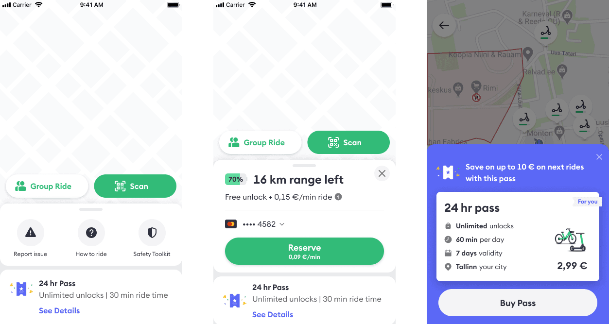
Direction 1: Improve discovery
A permanent place to find passes without leaving micro-mobility vertical
A permanent place to find passes without leaving micro-mobility vertical
I explored introducing passes directly on the scooter map experience. This decision itself allows users to see passes offerings without having to leave micro-mobility. These explorations were to extend the capabilities of existing components. I made use of what was available to increase the speed of A/B tests.

Control: Dismissible entry point on the map
Control: Dismissible entry point on the map

Option 1: Passes on animated Floating action Button
Option 1: Passes on animated FAB

Option 2: Non dismissible entry on bottom-sheet
Option 2: Non dismissible entry on bottom-sheet

Direction 2: The interface shift
Making purchase decision a part of scooter selection decision
Making purchase decision a part of scooter selection decision
Users on the micro-mobility map already intent to take a ride, a scooter selection is a part of that decision and my instinct was to club two decision to select a scooter and buy a pass together. Based on the hypothesis that while making a scooter selection, users are more like to also make the decision to buy a pass, so next, I moved pass recommendations into the scooter selection flow
Users on the micro-mobility map already intent to take a ride, a scooter selection is a part of that decision and my instinct was to club two decision to select a scooter and buy a pass together. Based on the hypothesis that while making a scooter selection, users are more like to also make the decision to buy a pass, so next, I moved pass recommendations into the scooter selection flow
User was already asking: "How much will this ride cost?" and "is it worth taking the pass?" comparing passes and future trips. The pass decision became part of the scooter decision. Not a separate product.
User was already asking: "How much will this ride cost?" and "is it worth taking the pass?" comparing passes and future trips. The pass decision became part of the scooter decision. Not a separate product.

Iteration 1.1: Banner

Iteration 1.2: Progressive Disclosure

Iteration 1.3: Open Pass Cards
The A/B Test Setup
Validating the Shift
Validating the Shift
Once I changed the team's outlook and we aligned on moving passes into the ride journey, we needed to test the executions. I proposed a live A/B test to isolate the two design directions I explored above.
Instead of guessing which layout would solve decision paralysis best, we tested them against each other to see how interaction cost affected conversion:
We launched the dedicated entry point on the main map sheet to test if simply un-burying the access point would drive confident purchases.
Test 1: Targeted Pass (cheapest, most popular or a valued pass on map and vehicle cards)

Test 2: Pass page entry point on map and vehicle cards to show all passes
While A/B tests were actively being prepared , I refined the UI and layout. Feedback from designers, product and engineers led to changes in changes in the Information architecture of the Vehicle Card.
A Pay per ride card was also introduced to keep the choice of choosing between a pass in the same information herirarchy.
Imapact and Learnings
The Multi-Category Impact
The Multi-Category Impact
Although I left Bolt before the final rollout of the advanced phases, the strategic reframing and design architecture I established created the permanent framework for how Passes operate today:
The Architectural Blueprint
Successfully led the structural separation of the pass ecosystem from ride-hailing subscriptions. This allowed both product verticals to scale their funnels independently without creating information overload.Verifying Value
The A/B testing framework validated that systematic, contextual inline passes significantly outperform massive full-page passes when user intent is high. It proved that great design is about subtraction, not addition.Horizontal Scale: True design leadership is about building reusable systems.
Today, Bolt Drive (Car Sharing) utilizes this exact horizontal "Pass" matrix to display hourly and daily rates on the active car selection sheet—proving that a clean decision framework works across any service a user wants to rent.